Tuesday, December 9, 2014

Using Overridden members with Partial Mocks for abstract Types

For a serious unit testing mocking framework is a required piece. It allows creating mocks for dependencies we don't want to instantiate in our code. We discussed about partial mocks long time ago [refer post]. They are specially useful for testing abstract types. Actually they provide a proxy implementation for the virtual / abstract members.

In this post we are going to discuss a special case when we have overridden some members of a parent type. We might not have overridden the other members or we just are good with the default null proxy implementation. Generally the mocking framework would just provide proxy implementation for all virtual / abstract members. How can we make sure that it uses the implementation in our type if we have provided so.

For our demo project, we are using nunit with Moq. Let's create a test project, and add the following nuget packages.


Here we have introduced BaseClass with a public member [Calculate] and two abstract members [CalculateCore and SomeOtherMethod]. It is inherited from another type ChildClass, which provides an implementation of CalculateCore only.


Now let us try to add unit tests for testing the functionality for this type. Here we have added a methods to check the result of Calculate method. Since we have added a definition of CalculateCore member, it should be adding the two parameters and just returns the result.


When we run this test, we get failure. If we look at the result, it doesn't actually make a lot of sense. Actually it is not even using the CalculateCore implementation from ChildClass.


But can we actually tell mocking framework to avoid providing implementation of overridden members. Actually Moq supports this by providing CallBase member for Mock. Here we have another implementation of the same ChildClass. The only difference is that mock has this member set. Now it should use the overridden member, CalculateCore, and test should pass.


And test passes now, Zindabad!!!

Thursday, December 4, 2014

Bluetooth Smart Beacon Specifications

Apple released iBeacon with iOS 7. iOS is a very big segment of smart phone users but there is a big market for android and other OSes as well. As apple made it difficult for the iBeacon manufacturers for providing SDKs for Android, they came up with alternate specifications as a workaround. One such example is AltBeacon from Radius Network. You might...

Tuesday, December 2, 2014

iBeacons & Bluetooth LE

Bluetooth Low Energy (Bluetooth LE) is also known as Bluetooth Smart. It is designed to provide Bluetooth based functionality without draining the battery power of your device. Bluetooth LE is part of Bluetooth 4.0 specification. You can download the specification from Bluetooth.org. You would find three kinds of…

Saturday, November 22, 2014

Running Redis Server On Windows

Redis is a high performance key / value store. It is a NoSQL database. It supports various types of values including scalar and complex data structures including list, set, sorted set and hashset. We can just serialize our (e.g. JSON or XML) and just push it to Redis.

In this post we are going to learn how we can setup Redis on a Windows machine. In some later posts, we should see how we can build some example applications using Redis...

Thursday, September 18, 2014

Amazon S3 Sink for Semantic Logging Service – Enterprise Library 6

Event Source API was introduced in .net framework 4.5 to support semantic logs. It allows an application to author events. These events are generated as ETW events which can be consumed in-proc or out-proc. For a general in-proc consumption, the API has introduced EventSourceListener type.

Semantic Logging Application Block (SLAB) has developed on top of EventSource API with more focus on event’s consumption. It has introduced sinks for consumption which are utilized by ETW event listener in the application block. These events are destination specific. The Pattern & Practices (p&p) team...

Saturday, August 23, 2014

Email Marketing & Amazon Simple Email Service (SES)

This is the age of social media. Our customers have myriad of different gadgets in the form of phones and tablets. But even in this day and age, e-mail promotions and marketing is still heavily used and relied upon. Do we need to delve and create innovative ways into sharing the promotions and marketing other than this? Is e-mail marketing still effective? In this post, let’s try to understand...

Friday, July 4, 2014

Android Development - Services

This is a continuation of a post for building an android app for displaying GitHub contributions of a user. We are pulling down profile and repository details of the user. As we are adding features to the app, we have been learning about android and its development model.

Currently we are at the point that we can download the data asynchronously and display it on the UI. We can also change user and the data is downloaded for the new user. In this post, we want to build up on this by moving all the heavy lifting for downloading the data to a background service...

Tuesday, June 24, 2014

Android Development - Offline Support

This post is amongst the series of post for discussion about development of an App in Android Platform. We have been developing an app, named GitHub Contributions as an example. In each post, we keep adding some new feature to the app, which adds to our knowledge about android.

In this post, we are going to see how we can add offline support to our app. So if a user has launched our app and there is no internet connection available, we cannot download user profile’s data from github.com. In this case, we can show any previous data downloaded for the specified user. If we are running the app for the first time for the user, then we can just show a Not-Connected message on the screen. As soon as the user connects to the network, we can attempt to download the information and show the pretty view.

Read more....

Thursday, June 12, 2014

Android Development - Scheduled Execution

This is a continuation of our post discussing different areas of android development. We are getting introduced to android development while developing an application GitHub Contributions App. There are a number of ways we can delay processing of some work in android. It also allows us to execute these work items on a periodic basis. There are a number of options for an android developer for introducing scheduled execution.

Read more...

Saturday, June 7, 2014

GitHub Contributions App - Android Internal file Storage

This is a continuation of a post for building an android app for displaying GitHub contributions of a user. We are using name of user for pulling down profile and repository details of the user. As we are adding features to the app, we have been learning about android and its development model.

Currently we are at the point that we can download the data asynchronously and display it on the UI. User can also change user and the data is downloaded for the new user. In this post, we want to build up on this by adding the following:

Keep the data in a file so that when the app needs it it can just be pulled from a file rather than being downloaded from the web. This can also cater to the offline scenarios when the app is launched while being disconnected from the network. We also don’t need to download data if the app is launched within 3 hours of when the data was downloaded last time.

Read more...

Sunday, June 1, 2014

GitHub Contributions App - Android App Preferences

In this post we are continuing with the app. We will be updating the action bar from default to custom. Currently, you can only see author’s GitHub contributions. We will be providing a setting to change GitHub user. The feature will be provided by adding an action bar button for settings. Read more...

Tuesday, May 20, 2014

XAML - Designing for Automation - Exposing ControlTemplate (s)

Application design and development is an art. It requires to be adept in tools of the trade. For Xaml technologies, the better you are in writing XAML and underlying framework, the better designer you are. For developing WPF applications, very commonly, we use custom controls, control templates and data templates but they make it really difficult to automate our applications. I thought it would be a good idea to write a two-part series to discuss the roadblocks of automating UIs and their possible solutions. This is the first part of the series. Here we are discussing how to expose elements from a ControlTemplate.

For this post, we will be assuming that you have Windows SDK installed on your machine. We would be using UI Automation Verify tool from the SDK. You can download the SDK from Microsoft's download page.


Let's consider a very simple application. It just consists of a button shown in the middle. The requirements suggested that it has to be elliptical and painted as green. It has to have some text at its center with some border around. In the bottom, it should have a copyright text. As ugly as it can look, it is shown as below :)


This is the XAML used for creating the above window. Here we are using a custom button. We are not adding anything else to the button but we are setting some properties. The underlying button should use them.


Since this greatest button is not available off-the-shelf, we need to update the existing button's ControlTemplate. Here we are adding Ellipse, Border and TextBlocks to the template. In order to respect the properties defined in parent control, here we are using TemplateBinding.


Here UIAutomationButton is derived from Button. Let's keep its definition empty for now. Let us run the application now. When we try to view the hierarchy in UI Automation, it is surprising to see that we see no elements under button. We know that they are in the ControlTemplate. Now your automation guys would complain that they cannot see any elements under the button, so they cannot automate this application.


Now previously we have discussed that Microsoft has provided UIAutomation API for nearly all of its UI technologies including WPF. For exposing elements for automation, we introduce AutomationPeer for elements. Generally, there is a 1:1 correspondence between a control type and its automation peer. It is the responsibility of control authors to provide automation peer for the controls for automation. We have discussed about AutomationPeer here [Discussion about AutomationPeer].

In order to expose the elements defined under the control template, we need to introduce a new AutomationPeer for the new button type. The type inherits from ButtonAutomationPeer defined under System.Windows.Automation.Peers namespace in PresentationFramework assembly. In order to provide the automation peers for its children, an AutomationPeer needs to override GetChildrenCore method. The method returns a list of child automation peers for its children. Now don't go recursive, it just needs to do it for its immediate children.

Just look at how it is finding the expected children from Owner's Template using FrameworkTemplate.FindName() method [MSDN].


There are no AutomationPeer(s) provided for the types which are not expected to be automated. They include shapes , decorators and panels [MSDN Reference]. In this example, I have included all three of them i.e. Border(Decorator), DockPanel(Panel) and Ellipse(Shape). It is possible that we want to automate and verify some of them. In the above example, we have assumed that we don't have to expose DockPanel but we do need to do it for Border and Ellipse. Since there is no custom automation peer for them, we have just used FrameworkElementAutomationPeer for Ellipse.

Since we have to expose a child TextBlock from Border, we need to define a custom AutomationPeer for border. Here we have defined UIAutomationBorderAutomationPeer for this purpose. Since the TextBlock is directly a child of Border, we can access that using FrameworkElement.FindName() method [MSDN].


Now the control needs to tell automation framework about AutomationPeer it prefers for automating itself. It does so by returning an instance of the intended automation peer in an overridden OnCreateAutomationPeer() method [MSDN].


Now let's run it again and try to see how it has affected the hierarchy for automation. Here we notice that although the Ellipse and Border is available but there are no TextBlock(s). Now we know we have two TextBlocks in our design. But why are they not visible here?


Actually TextBlocks are not always visible for automation. I have no idea why Microsoft decided to hide TextBlocks from automation when they are part of a ControlTemplate. They are visible only when they are part of a ContentPresenter in a DataTemplate. Since Microsoft has opened up its Source code for easy reference, you can verify this from here:


Since TextBlocks are defined under a ControlTemplate, they are not available for Automation. In order to fix this, we need to add a new AutomationPeer for our TextBlocks. You don't need to provide a derived type for TextBlock. Only a child TextBlockAutomationPeer with overridden IsControlElementCore() should be enough.


We also need to update the other Automation peers to use this instead of TextBlockAutomationPeer wherever we need to expose TextBlocks.


Now the UI Automation Verify should be able to show the hierarchy as follows:


Now we just need to assign AutomationIds to these controls in order for them to be automated. Zindabad!!!

Get It from GitHub


What about Template Parts [Part_SOMETHINGS]
Now let me give you an exercise to practice what you have learned here. As an example we have this Custom ListBox with Header as a TemplatePart. We are naming it as Part_Header.


And we have the ControlTemplate for the ListBox as follows:


We are using the HeaderedListBox as follows to create our UI.


But when we look at the UI Automation Verify. The whole hierarchy under the list box is empty.


Let’s see if you can create an automation peer for this. Keep me posted.

Tuesday, May 13, 2014

Simple App Orientation for Windows Store Applications With Prism

In this post we are trying to focus how we can control application state for an App. We have chosen Windows Store Apps as the platform of choice. It provides SimpleOrientationSensor as the device orientation changes.

Let's start with PCL
Let's create a simple Portable class library project. We are naming it as SimpleOrientationEx.Portable. The project is supposed to hold the orientation state type. The application state would be based on an enumeration type, also defined in the same PCL project. For this simpleton project, let's use the maximum numbers of target frameworks.


These are the simple possible orientations of the app. It includes portrait, landscape and their contra-states. It also has face-up and face-down states. These are the states when the device is held in a perfect horizontal position either face-up or down. As a developer, you might have realized that it is really difficult for an app to determine how the device is being held, and should the display be using portrait or landscape layout.

Now let's introduce an interface type to hold the current application orientation. It holds the state in a CurrentOrientation property. We are naming the interface-type as IAppOrientation.

Let's implement this now. In addition to implementing the CurrentOrientation member from the interface type, it also introduces a protected member to update the current orientation of the App.


Windows Store App Orientation
As an example application, let us consider Windows Store Apps for Windows 8.1. We are creating a specialized type of AppOrientationBase class to hold the orientation state of a Windows Store App. The specialized type is named as AppOrientationWindowsStore.

Windows Store Apps can use SimpleOrientationSensor to determine the device orientation. The sensor type is available in Windows.Devices.Sensors namespace. It provides the application orientation using enumeration type.


The enumeration type has similar values as our AppOrientationState. We can define a mapping between the enumeration values of AppOrientationState and SimpleOrientation. Here MapOrientation() method is defining this mapping for us.

Let's introduce Reactive Extensions
Here we are adding reactive extensions core nuget package [Reactive Extensions Homepage]. Not only this makes throttling these events a child's play but also provides the events as Obervable.OnNext() sequence. This can be achieved using Obervable.FromEventPattern().

Since updating the layout for orientation change can be very involved process rendering heavy load elements, let us throttle the orientation changes a little. Here we are throttling the OrientationChanged event from SimpleOrientationSensor for one second. The throttled events are not raised in the publisher's thread but a different thread pool thread. Since we are updating the UI in the subscription code, we can observe the sequence using SynchronizationContext.Current. This would execute the handler code in the required UI thread.


Prism for Windows Store App
Now let us add Prism for Windows Store App nuget package. We introduce the main view model for the App. It just has a string based property to hold some text data. The view model inherits from ViewModel type from Prism.

The view model keeps the App orientation. It instantiate the member using default SimpleOrientationSensor. Like other Windows Store App sensors, SimpleOrienationSensor singleton instance can be obtained using the static GetDefault() method.

Prism for Windows Store App provides the support of restoring the application state using RestorableState attribute. We are decorating the only property with this attribute. This should restore the application state when application is restored to Running from Suspended state. [MSDN: App Lifecycle] [Handling Suspend, Resume & Activation in a Windows Store App]


Prism for Windows Store App also provides MvvmAppBase type. We can inherit from this to further control the App. Here we are overriding OnLaunchApplication and OnNavigationFailed methods. Here OnLaunchApplication is being used to navigate to MainPage.xaml as the app is launched. Based on the convention, we must have [X]Page.xaml. Here [X] is the first argument to the NavigationService.Navigate() method. We can override this mapping by overriding GetPageType() method. It is passed with the same string as pageToken and it should return the mapped Page type.

Now we add an IValueConverter to convert the enumeration value to string.


App Orientation and View Updates
Now we turn our attention to the view. We have a simple view with a TextBlock and TextBox. They are bound to the same property in the view model. Here we are using Prism's view model auto-wiring capabilities. The view model should be named following the Prism's convention. For our case, it is named as MainPageViewModel [ [X]PageViewModel ].

Here we have also introduce a RotateTransform for the Grid to the RenderTransform property. We are defining the center of the grid as the origin of the transformation by assigning RenderTransformOrigin as "0.5, 0.5".

Now we add Visual states to the page. All of these states correspond to different states in AppOrientationState enumeration. In order to keep the example simple, we are just animating the RotateTransform defined above for the Grid. It just rotates it keeping the view always upright. We are also defining transitions to these states to ease the rotation effect.


Introduce Behavior SDK (XAML) extension
Now we need to define the transitions between these states. These transitions should be based on the states in IAppOrientationState in MainPageViewModel. This is very tricky in Windows Store Apps as there is no DataTrigger support for the platform. In Visual Studio 2013, Microsoft added support for some behaviors including DataTriggerBehavior. Let us add the extension SDK using Reference Manager dialog.


In addition to DataTriggerBehavior, we are also using GotToStateAction from the same extension. This can be used to transition to a particular visual state.


Get Code from GitHub

Tuesday, April 8, 2014

Reactive UI - Part I [ Setting the Ground Up ]

All of us who have been designing and developing using XAML technologies use ICommand interface on a daily basis. The interface requires implementation of Execute() and CanExecute() methods. Here Execute method is used to perform an action in response to a user interaction. However, the action can only be executed if CanExecute() method returns true. You might have commonly seen a Command being bound to a button. In this case, button would be enabled or disabled based on the evaluation of CanExecute() method of the ICommand. Now let me throw the main question in the air...

Can we run into a situation when a button is enabled when it is not supposed to, and How often ICommand.CanExecute() is called?

Let me first give you the answer of first part of the question, YES, we can certainly run into situations when a button should be disabled when it is supposed to be enabled and vice versa.

The second part of the question is tricky. It is dependent upon the implementation of ICommand. Other than the required Execute and CanExecute() methods, the interface also requires implementation of CanExecuteChanged event. So CanExecute method would be called in all those instances when the command raises this event. If you look at Josh Smith's implementation of ICommand i.e. RelayCommand, here we are directly hooking it up with CommandManager.RequerySuggested event. Now all user interactions would result in re-evaluation of CanExecute(). But what if the underlying property changes value in response to an event other than any user action. In all those situations, we could face this problem.


We might have different implementations handling this differently. This is quite similarly handler in MVVMLight Libs.


And this is from Prism's DelegateCommand type. That's why we need to call RaiseCanExecuteChanged for DelegateCommand every time we need re-evaluation of CanExecute method.


In order to understand the severity of the problem, let's create a sample WPF application. The following is a sample view model with FirstName property of type string. It also has an ICommand property, SubmitCommand. Here we are using Josh Smith's implementation of ICommand i.e. RelayCommand. The code can be found at his original article on msdn. In the command's CanExecute() method, we are checking if FirstName is null or empty, we are returning false in this case. This should disable the button.


And here is the view which is using the view model, defined above, as its DataContext. It is Binding the FirstName property to a TextBox. Since UpdateSourceTrigger is set as PropertyChanged, it would continue to update the source property as user keeps modifying the text. It also has a button which binds its Command property to view model's SubmitCommand. Now clicking the button should cause running the Execute method of the command. The button should be enabled only when the command's CanExecute() method returns true.


As we are modifying the text in the TextBox, we see that as we empty the TextBox, the button is disabled, which is as expected.


Actually modifying the content of the TextBox cause CommandManager.RequerySuggested to be triggered. Since RelayCommand uses this, it causes CanExecuteChanged event to be triggered. Since the UI framework hooks up to this event. It causes CanExecute to be called.

In order to understand the problem, let's add the following code to our view model. It just flips the value of FirstName property between string.Empty and "Not Empty" literal. Here we expect that as soon as we set it to String.Empty, the button should be disabled. Here we are using a System.Timers.Timer for this purpose. Since Elapsed event is invoked on a ThreadPool thread, the value is being updated without any user interaction on a non-UI thread. Since WPF is very forgiving about PropertyChanged on a non-UI thread, we don't have Dispatcher issues for assigning a value to FirstName in this thread.


Let's run the application and see the result. As shown here, the button is always enabled. This is how we have defined CanExecuteChanged event in RelayCommand. Since MVVMLight's RelayCommand is also defined similarly, we should have the same problem there. For Prism's DelegateCommand, we need to call RaiseCanExecuteChanged(), which raises CanExecuteChanged event for the command.


Now we understand the problem. In the next post, we are going to see how we can resolve it. Stay tuned!

Tuesday, April 1, 2014

Viewing Markdown Text in WPF Applications

From HTML to XML, we have seen a lot of markup languages. They are generally considered as languages which have TAGS. These tags are generally angle brackets. Historically, the word came from book publishing. If you look at Wikipedia, Markup languages are defined as follows:

A (document) markup language is a modern system for annotating a document in a way that is syntactically distinguishable from the text.

So it is to provide extra information with the text in order to further define it. These annotations can be used for presentation and processing of the text. It can also set some piece of text aside from such treatment. Generally, the presentational aspect of markup are considered and used. These languages describe how some data should be formatted and displayed. They are document formatting in nature. Since we have different data display requirements in various scenarios, there are many markup languages developed to handle them. HTML describes formatting of documents displayed in a browser. So it is browser specific and cannot be used outside its context.

The idea of Markdown is considered an opposite of Markups. This was created by John Gruber in 2004. For Markdown, we describe how data should be presented, but this is not specific to any target engine. You can develop a parser to render the input text to your required format. As the world is getting older, we have more and more need to support cross platform applications as developers. So, we can write some text in a Markdown style and transform it to the format of our choice. The concept is similar to Rich Text Format (RTF) but this is not properietry. There are a number of markdown flavors but we are not going to discuss them here as they still need to be standardized.

The standard file extension of a markdown file is *.md. As Markdown has gained popularity, it has enjoyed very fast industry wide acceptance. The most popular amongst the adopters of the format is StackOverflow.com. Wordpress and other Blog Engines have plugins to support the format. Even GitHub's Read Me file uses this format. Vim , Notepad++ and Sublime editors also have plugins to support Markdown syntax highlighting and previewing.

Markdown Editors
There are many markdown editors available. They are available online and for installation. I am listing some of them here. Just search for Markdown Editors.


Let's write some Markdown now!
Let's write some markup now. Here we are using Markdown.Xaml tool. The tool can be downloaded from here.


You can download the markdown text from the following. It is in markdown format. Since we have saved it using *.md file extension, it is displayed as formatted. Just select View Raw from the following editor.


Let's see how easy it is to convert the Text to Html. We can use MarkdownSharp nuget pacakge for this purpose for our .net applications. It provides the type to transform a markdown text. The tool supports transformation to HTML format.


Let's see how the converted text looks like. Here we are previewing the converted text in Text Visualizer in Visual Studio.


How to use this for WPF?
Since this is giving output as HTML, the easiest option is to use a browser control and somehow render this converted HTML as browser already supports such formatting. What if we don't or can't use it like that. Is there a way to show it as native WPF. Yes, there is. But we need to use a solution from Bevan Arps. There is currently no nuget package for this. But since the code is available on GitHub, we can get the code and build it locally. We can the use the library and reference it in our project.


Running the code would read the markdown text from the file. It then transforms it using the Markdown type. The type transforms the text into FlowDocument, which can directly be used in a WPF application. As you can notice, the utility is not perfect as you can notice that Heading has not been transformed correctly. But this can be good enough for your needs. Just check it out!


This solution should be good for WPF. Silverlight doesn't support FlowDocument yet. So you might want to search for other solutions for markdown. Although you should be able to find some Markdown editors in Windows Phone and Silverlight, but I couldn't find a Markdown viewer for them.

Tuesday, March 25, 2014

Using ScrollViewer in Windows Store Apps - Determining Scrollable Contents

In this post, we will be trying to discuss options available to determine whether ScrollViewer's contents are partially hidden. The options would be looked at from a Windows Store App perspective. But they are quite generic and should be easily usable in other XAML based platforms including WPF and Silverlight and Windows Phone applications.

Let's first add an image to our project. We would be using pan and zoom with this image to understand how we can determine whether we have any horizontal and vertical scrollable content. Here we are setting the Build Action as 'Content'. This would allow us to use ms-appx:// Uri syntax to reference the image. In those cases, we would be showing some content in the application. They would be just TextBlocks showing details of available scrollable contents.


ComputedHorizontalScrollbarVisibility and ComputedVerticalScrollbarVisibility
As we know we can use HorizontalScrollbarVisibility and VerticalScrollbarVisibility to set whether and when scrollbars should be available. They are both of type ScrollbarVisibility. The possible values are Auto, Disabled, Visible and Hidden. The values are irrespective of whether the scrollbars are currently displayed or not.

ScrollViewer provides another set of properties to determine whether scroll bars are currently displayed or not. It must be remembered that this is irrespective of whether we have any available scrollable regions. They are read-only properties, and named as ComputedHorizontalScrollbarVisibility and ComputedVerticalScrollbarVisibility. They are useful when the options to set the visibility are set as Auto.

In the following example we are adding an image to ScrollViewer. Since we need Panning and Zooming, we have enabled the ZoomMode for the ScrollViewer. Here we are using ms-appx:// Uri syntax to reference the image we just added. You can see that we are adding two TextBlocks, one on the top and other on the left side. We are binding the visibility of the Borders containing these TextBlocks to ComputedHorizontalScrollBarVisibility and ComputedVerticalScrollbarVisibility. This would show them only when their corresponding scrollbars are visible.


Now let's run the App and see how these controls are displayed as the horizontal and vertical scrollbars are shown.


Using Extent, Viewport & Scrollable Height and Width Properties
The computed properties to determine the visibility of scrollbars work great but they we need to set the Visibilty of scrollbars to Auto for them to work. In most of the touch scenarios, we don't have this luxury available. For such cases, we can directly use other properties to determine if we have any scrollable contents available. These properties are ExtentWidth, ViewportWidth, ScrollableWidth and the Height counterparts. The values for these properties are calculated as follows:


Now for a WPF application, this can be a lot easier as we have DataTriggers for Style. We can use them to perform certain operations on the screen as ScrollableProperty ( ExtentProperty - ViewPortProperty) > 0. But we can still use IValueConverter to convert and bind them to Visibility for the Border controls used in the previous example. It must be remembered it is not the same WPF interface as Convert and ConvertBack signatures are different. It is also in Windows.UI.Xaml.Data namespace instead of WPF's System.Windows.Data namespace. Let's introduce an IValueConverter. The converter returns Visibility.Visible when the bounded value is greater than zero. It returns Visibility.Collapsed otherwise.


Let' use the converter defined above for our purpose. Notice the xmlns:ns="using:NAMESPACEsyntax for namespace declaration in Windows Store apps compared to xmlns:ns=clr-namespace:NAMESPACE. This is closer to the C# code namespace declarations.


This behaves exactly the same way as in the previous example. If this were a WPF application, we also had some extra options to control the visibility of these Border controls. These options are as follows:
  1. Style Data Triggers: We can set these borders as Collapsed by default. We can then set Visibility to Visible when ScrollableProperty > 0.

  2. Using Blend SDK Conditional Behavior: We can use Blend SDK's Interaction triggers. We can use ScrollChanged event from ScrollViewer. The SDK conditional behaviors allow us to use ConditionalExpression. We can use GreaterThan expression to determine if ExtentProperty is greater than ViewPortProperty. We can the use ChangePropertyAction to set the visibility of these border controls.
Download Code

Tuesday, March 18, 2014

WPF - Custom ToolTip Placement with more Options

WPF allows us various options to customize ToolTips. We also have different options for appropriate placement of ToolTip. But they are very limited and just include positioning the ToolTip on top, bottom, right and left of a control. In this post, we are trying to create a behavior to appropriately place our ToolTip. The behavior should allow us to position it around different edges and corners e.g. Bottom - Right.


Let us create a WPF project for defining this behavior. We need to first add these enumerations to allow users to specify the placement of ToolTip.


Now let us add a behavior for placement of tooltip. You would need to add an assembly reference of System.Windows.Interactivity from Blend SDK to use Behavior<T>. In order to place the tooltip, we are using the two enumerations defined above. Since these would be static values assigned in XAML, we are introducing them as CLR properties. If we need to bind them, we can add them as dependency properties.


Since we are custom placing the tooltip, we can use CustomPlacementCallBack delegate defined for a ToolTip. We can assign a computation method to the delegate. The method can calculate the placement of the ToolTip based on the option specified in the HorizontalPlacement and VerticalPlacement properties


Now we need to calculate where we want to show the ToolTip. In addition to the options specified using VerticalPlacement and HorizontalPlacement properties, the delegate arguments provide us the details about the size of target control, from targetSize parameter, on which the ToolTip is being displayed. We also have the details about the ToolTip size from popupSize parameter. The behavior's user can also specify further offsets for the ToolTip using ToolTipService.VerticalOffset and ToolTipService.HorizontalOffset attached properties on the control. They are available in offset parameter. Now we have all the details to calculate the exact position to place the ToolTip.


Let's first define the templates for out ToolTip. This is how we want to display our ToolTip.


Now let us see how we need to add this to a target control. Here we are adding our behavior to a Border control. Using the attached properties in ToolTipService, we have specified that we want to place the tooltip based on some custom calculations. For a complete description of features of ToolTipService, we can refer MSDN.


It must be remembered that, by default, when we just select Custom placement option, all the calculations would be using the top left of the target control as a reference point.


Now let's see how to calculate the vertical and horizontal offset of the ToolTip. For the Horizontal offset, we just need to move it all the way on the right side of the target. So we can use target's Width for this purpose. We can also add the horizontal offset which might be defined on the control. We can do similar calculations for calculating vertical offset.


Here is how we are calculating the horizontal offset. Based on this, you can imagine the calculation of vertical offset.


What if ToolTip cannot be displayed on Calculated Position?
Since tool tips depend on the location of target control. Now the window containing the target control might be situated as such that the tooltip cannot be displayed because of being cut by screen corners. In that case, if we just use the above code, WPF just moves the ToolTip on its own so that it can be shown. But we can totally control the alternate location if it cannot be displayed on the location we first calculated. If we just look at the signatures of CustomToolTipPlacement delegate, it is returning an array. The placement options would be prioritized as such that the first element has the highest priority. The runtime can use the next one if it cannot be displayed on the first location.

If we look at the definition of above behavior, we have defined calculation methods as protected virtual. We can override this in a child behavior to achieve the required effect. Let's do it as follows:


Get it from Git

Tuesday, March 11, 2014

WPF : Using Adorner for overlaying Empty Collections

Adorners can be used for a number of things in WPF. Mostly they are used to provide feedbacks to indicate control states in response of certain events. You might have seen this for applications supporting drag and drop operations. They are also used to overlay visual decoration on top of an element e.g. control in error. You might have seen adorners when we allow users to manipulate elements including resizing, rotating and repositioning. Lastly, we can use them to mask a UIElement.

In this post, we will be using adorners for overlaying an empty items control. This is like ALT message in HTML image when the image is not loaded for any reason. This can be used to provide feedback to user why this ItemsControl is empty. We can also provide links to navigate to the application area which can be used to fix this. This may include some configurations, connecting to a network or whatever the case may be. Here we will be providing support for providing the details of DataTemplate and Content to be used in the adorner layer of an empty ItemsControl. This would give application developer complete control about the look and feel of the empty state.

For a brief introduction about the feature, you might want to skim through this post [WPF Adorners]. This post is specific to WPF as Microsoft removed adorners for Windows Phone and Windows Store applications.

Let's first create the adorner. The adorner creates a ContentPresenter using the DataTemplate and Content details. The ContentPresenter is then added to the adorner layer of the ItemsControl being adorned, which is expected to be defined under an AdornerDecorator element in the XAML.


Now let's define our behavior. It just keeps an instance of the adorner defined above and hooks up to event as the items are being changed in the ItemsControl being adorned. If the element count is ZERO, it just turns the Adorner as visible. It has two dependency properties to assign a DataTemplate and Content to the


Now we just need to add the behavior in the UI code. Here we are assigning the DataTemplate and Content to the behavior's properties.


Now we can run the application. As the ItemsControl becomes empty, it shows the following overlay. This is hidden as elements are added to the collection.


You can download the source code from here:

Monday, March 3, 2014

XAML - Conditional Formatting with Section Separators

We have seen Binding.StringFormat being used a million times with binding. But have you ever thought how to format the numbers when we need to show zero valued, negative and positive numbers separately. I saw someone using three different TextBlocks and using DataTrigger and similar logic to select based on the bound value. This code seems like too much for such a simple thing. So I thought about writing this post to share a simple solution to do the same.

As a matter of fact, the solution is not special to a WPF project. This can be used to format numeric values even in a non-WPF based applications. The idea is to use custom numeric formatting based on section separators.

Let's create a WPF project. We add a ViewModel to the project MainViewModel. It just has a property NumericProperty. The property is of integer type backed by an integer field.


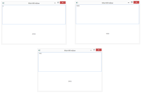
Let's create a view with a TextBox and TextBlock. We need to view the formatted value in the TextBlock as entered in TextBox. But the requirement is that positive values should be shown as entered and negative values should be shown in a paranthesis. Zero value should be displayed as literal "ZERO" in the TextBlock.


Now let's have a look at the value of StringFormat specified for the TextBlock.Text binding. It uses section separators to declare format. Here are the three sections in the specified expression.


Now let's run the application. Here we enter zero, positive and negative values and see the expected result.


Here we don't have to specify all the sections. If we want to apply the same formatting for negatives and zero {0:#;(#)}, we can just use two sections. The formatting specified in the second section would be used in for both of them. If we want to use the same formatting for all positive and negative numbers and need to use a different one for zeros, we can leave the second section empty {0:#;;ZERO}.

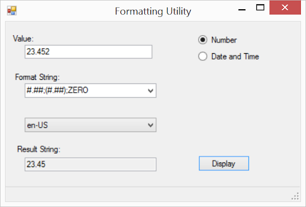
In order to practice further with formatting, you can download this cool utility from Microsoft. The tool allows you to provide custom formatting and displays result so that you can test the expression before using it in your application. You can download the source code of the utility.