Showing posts with label wpf. Show all posts

Tuesday, May 20, 2014

XAML - Designing for Automation - Exposing ControlTemplate (s)

Application design and development is an art. It requires to be adept in tools of the trade. For Xaml technologies, the better you are in writing XAML and underlying framework, the better designer you are. For developing WPF applications, very commonly, we use custom controls, control templates and data templates but they make it really difficult to automate our applications. I thought it would be a good idea to write a two-part series to discuss the roadblocks of automating UIs and their possible solutions. This is the first part of the series. Here we are discussing how to expose elements from a ControlTemplate.

For this post, we will be assuming that you have Windows SDK installed on your machine. We would be using UI Automation Verify tool from the SDK. You can download the SDK from Microsoft's download page.


Let's consider a very simple application. It just consists of a button shown in the middle. The requirements suggested that it has to be elliptical and painted as green. It has to have some text at its center with some border around. In the bottom, it should have a copyright text. As ugly as it can look, it is shown as below :)


This is the XAML used for creating the above window. Here we are using a custom button. We are not adding anything else to the button but we are setting some properties. The underlying button should use them.


Since this greatest button is not available off-the-shelf, we need to update the existing button's ControlTemplate. Here we are adding Ellipse, Border and TextBlocks to the template. In order to respect the properties defined in parent control, here we are using TemplateBinding.


Here UIAutomationButton is derived from Button. Let's keep its definition empty for now. Let us run the application now. When we try to view the hierarchy in UI Automation, it is surprising to see that we see no elements under button. We know that they are in the ControlTemplate. Now your automation guys would complain that they cannot see any elements under the button, so they cannot automate this application.


Now previously we have discussed that Microsoft has provided UIAutomation API for nearly all of its UI technologies including WPF. For exposing elements for automation, we introduce AutomationPeer for elements. Generally, there is a 1:1 correspondence between a control type and its automation peer. It is the responsibility of control authors to provide automation peer for the controls for automation. We have discussed about AutomationPeer here [Discussion about AutomationPeer].

In order to expose the elements defined under the control template, we need to introduce a new AutomationPeer for the new button type. The type inherits from ButtonAutomationPeer defined under System.Windows.Automation.Peers namespace in PresentationFramework assembly. In order to provide the automation peers for its children, an AutomationPeer needs to override GetChildrenCore method. The method returns a list of child automation peers for its children. Now don't go recursive, it just needs to do it for its immediate children.

Just look at how it is finding the expected children from Owner's Template using FrameworkTemplate.FindName() method [MSDN].


There are no AutomationPeer(s) provided for the types which are not expected to be automated. They include shapes , decorators and panels [MSDN Reference]. In this example, I have included all three of them i.e. Border(Decorator), DockPanel(Panel) and Ellipse(Shape). It is possible that we want to automate and verify some of them. In the above example, we have assumed that we don't have to expose DockPanel but we do need to do it for Border and Ellipse. Since there is no custom automation peer for them, we have just used FrameworkElementAutomationPeer for Ellipse.

Since we have to expose a child TextBlock from Border, we need to define a custom AutomationPeer for border. Here we have defined UIAutomationBorderAutomationPeer for this purpose. Since the TextBlock is directly a child of Border, we can access that using FrameworkElement.FindName() method [MSDN].


Now the control needs to tell automation framework about AutomationPeer it prefers for automating itself. It does so by returning an instance of the intended automation peer in an overridden OnCreateAutomationPeer() method [MSDN].


Now let's run it again and try to see how it has affected the hierarchy for automation. Here we notice that although the Ellipse and Border is available but there are no TextBlock(s). Now we know we have two TextBlocks in our design. But why are they not visible here?


Actually TextBlocks are not always visible for automation. I have no idea why Microsoft decided to hide TextBlocks from automation when they are part of a ControlTemplate. They are visible only when they are part of a ContentPresenter in a DataTemplate. Since Microsoft has opened up its Source code for easy reference, you can verify this from here:


Since TextBlocks are defined under a ControlTemplate, they are not available for Automation. In order to fix this, we need to add a new AutomationPeer for our TextBlocks. You don't need to provide a derived type for TextBlock. Only a child TextBlockAutomationPeer with overridden IsControlElementCore() should be enough.


We also need to update the other Automation peers to use this instead of TextBlockAutomationPeer wherever we need to expose TextBlocks.


Now the UI Automation Verify should be able to show the hierarchy as follows:


Now we just need to assign AutomationIds to these controls in order for them to be automated. Zindabad!!!

Get It from GitHub


What about Template Parts [Part_SOMETHINGS]
Now let me give you an exercise to practice what you have learned here. As an example we have this Custom ListBox with Header as a TemplatePart. We are naming it as Part_Header.


And we have the ControlTemplate for the ListBox as follows:


We are using the HeaderedListBox as follows to create our UI.


But when we look at the UI Automation Verify. The whole hierarchy under the list box is empty.


Let’s see if you can create an automation peer for this. Keep me posted.

Tuesday, April 1, 2014

Viewing Markdown Text in WPF Applications

From HTML to XML, we have seen a lot of markup languages. They are generally considered as languages which have TAGS. These tags are generally angle brackets. Historically, the word came from book publishing. If you look at Wikipedia, Markup languages are defined as follows:

A (document) markup language is a modern system for annotating a document in a way that is syntactically distinguishable from the text.

So it is to provide extra information with the text in order to further define it. These annotations can be used for presentation and processing of the text. It can also set some piece of text aside from such treatment. Generally, the presentational aspect of markup are considered and used. These languages describe how some data should be formatted and displayed. They are document formatting in nature. Since we have different data display requirements in various scenarios, there are many markup languages developed to handle them. HTML describes formatting of documents displayed in a browser. So it is browser specific and cannot be used outside its context.

The idea of Markdown is considered an opposite of Markups. This was created by John Gruber in 2004. For Markdown, we describe how data should be presented, but this is not specific to any target engine. You can develop a parser to render the input text to your required format. As the world is getting older, we have more and more need to support cross platform applications as developers. So, we can write some text in a Markdown style and transform it to the format of our choice. The concept is similar to Rich Text Format (RTF) but this is not properietry. There are a number of markdown flavors but we are not going to discuss them here as they still need to be standardized.

The standard file extension of a markdown file is *.md. As Markdown has gained popularity, it has enjoyed very fast industry wide acceptance. The most popular amongst the adopters of the format is StackOverflow.com. Wordpress and other Blog Engines have plugins to support the format. Even GitHub's Read Me file uses this format. Vim , Notepad++ and Sublime editors also have plugins to support Markdown syntax highlighting and previewing.

Markdown Editors
There are many markdown editors available. They are available online and for installation. I am listing some of them here. Just search for Markdown Editors.


Let's write some Markdown now!
Let's write some markup now. Here we are using Markdown.Xaml tool. The tool can be downloaded from here.


You can download the markdown text from the following. It is in markdown format. Since we have saved it using *.md file extension, it is displayed as formatted. Just select View Raw from the following editor.


Let's see how easy it is to convert the Text to Html. We can use MarkdownSharp nuget pacakge for this purpose for our .net applications. It provides the type to transform a markdown text. The tool supports transformation to HTML format.


Let's see how the converted text looks like. Here we are previewing the converted text in Text Visualizer in Visual Studio.


How to use this for WPF?
Since this is giving output as HTML, the easiest option is to use a browser control and somehow render this converted HTML as browser already supports such formatting. What if we don't or can't use it like that. Is there a way to show it as native WPF. Yes, there is. But we need to use a solution from Bevan Arps. There is currently no nuget package for this. But since the code is available on GitHub, we can get the code and build it locally. We can the use the library and reference it in our project.


Running the code would read the markdown text from the file. It then transforms it using the Markdown type. The type transforms the text into FlowDocument, which can directly be used in a WPF application. As you can notice, the utility is not perfect as you can notice that Heading has not been transformed correctly. But this can be good enough for your needs. Just check it out!


This solution should be good for WPF. Silverlight doesn't support FlowDocument yet. So you might want to search for other solutions for markdown. Although you should be able to find some Markdown editors in Windows Phone and Silverlight, but I couldn't find a Markdown viewer for them.

Tuesday, March 18, 2014

WPF - Custom ToolTip Placement with more Options

WPF allows us various options to customize ToolTips. We also have different options for appropriate placement of ToolTip. But they are very limited and just include positioning the ToolTip on top, bottom, right and left of a control. In this post, we are trying to create a behavior to appropriately place our ToolTip. The behavior should allow us to position it around different edges and corners e.g. Bottom - Right.


Let us create a WPF project for defining this behavior. We need to first add these enumerations to allow users to specify the placement of ToolTip.


Now let us add a behavior for placement of tooltip. You would need to add an assembly reference of System.Windows.Interactivity from Blend SDK to use Behavior<T>. In order to place the tooltip, we are using the two enumerations defined above. Since these would be static values assigned in XAML, we are introducing them as CLR properties. If we need to bind them, we can add them as dependency properties.


Since we are custom placing the tooltip, we can use CustomPlacementCallBack delegate defined for a ToolTip. We can assign a computation method to the delegate. The method can calculate the placement of the ToolTip based on the option specified in the HorizontalPlacement and VerticalPlacement properties


Now we need to calculate where we want to show the ToolTip. In addition to the options specified using VerticalPlacement and HorizontalPlacement properties, the delegate arguments provide us the details about the size of target control, from targetSize parameter, on which the ToolTip is being displayed. We also have the details about the ToolTip size from popupSize parameter. The behavior's user can also specify further offsets for the ToolTip using ToolTipService.VerticalOffset and ToolTipService.HorizontalOffset attached properties on the control. They are available in offset parameter. Now we have all the details to calculate the exact position to place the ToolTip.


Let's first define the templates for out ToolTip. This is how we want to display our ToolTip.


Now let us see how we need to add this to a target control. Here we are adding our behavior to a Border control. Using the attached properties in ToolTipService, we have specified that we want to place the tooltip based on some custom calculations. For a complete description of features of ToolTipService, we can refer MSDN.


It must be remembered that, by default, when we just select Custom placement option, all the calculations would be using the top left of the target control as a reference point.


Now let's see how to calculate the vertical and horizontal offset of the ToolTip. For the Horizontal offset, we just need to move it all the way on the right side of the target. So we can use target's Width for this purpose. We can also add the horizontal offset which might be defined on the control. We can do similar calculations for calculating vertical offset.


Here is how we are calculating the horizontal offset. Based on this, you can imagine the calculation of vertical offset.


What if ToolTip cannot be displayed on Calculated Position?
Since tool tips depend on the location of target control. Now the window containing the target control might be situated as such that the tooltip cannot be displayed because of being cut by screen corners. In that case, if we just use the above code, WPF just moves the ToolTip on its own so that it can be shown. But we can totally control the alternate location if it cannot be displayed on the location we first calculated. If we just look at the signatures of CustomToolTipPlacement delegate, it is returning an array. The placement options would be prioritized as such that the first element has the highest priority. The runtime can use the next one if it cannot be displayed on the first location.

If we look at the definition of above behavior, we have defined calculation methods as protected virtual. We can override this in a child behavior to achieve the required effect. Let's do it as follows:


Get it from Git

Monday, March 3, 2014

XAML - Conditional Formatting with Section Separators

We have seen Binding.StringFormat being used a million times with binding. But have you ever thought how to format the numbers when we need to show zero valued, negative and positive numbers separately. I saw someone using three different TextBlocks and using DataTrigger and similar logic to select based on the bound value. This code seems like too much for such a simple thing. So I thought about writing this post to share a simple solution to do the same.

As a matter of fact, the solution is not special to a WPF project. This can be used to format numeric values even in a non-WPF based applications. The idea is to use custom numeric formatting based on section separators.

Let's create a WPF project. We add a ViewModel to the project MainViewModel. It just has a property NumericProperty. The property is of integer type backed by an integer field.


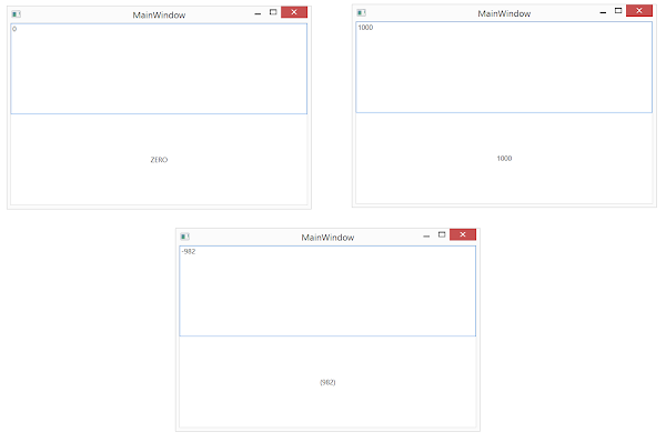
Let's create a view with a TextBox and TextBlock. We need to view the formatted value in the TextBlock as entered in TextBox. But the requirement is that positive values should be shown as entered and negative values should be shown in a paranthesis. Zero value should be displayed as literal "ZERO" in the TextBlock.


Now let's have a look at the value of StringFormat specified for the TextBlock.Text binding. It uses section separators to declare format. Here are the three sections in the specified expression.


Now let's run the application. Here we enter zero, positive and negative values and see the expected result.


Here we don't have to specify all the sections. If we want to apply the same formatting for negatives and zero {0:#;(#)}, we can just use two sections. The formatting specified in the second section would be used in for both of them. If we want to use the same formatting for all positive and negative numbers and need to use a different one for zeros, we can leave the second section empty {0:#;;ZERO}.

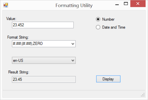
In order to practice further with formatting, you can download this cool utility from Microsoft. The tool allows you to provide custom formatting and displays result so that you can test the expression before using it in your application. You can download the source code of the utility.


Saturday, March 1, 2014

WPF - Ellipsis for Overflow Text in TextBlock

This is a very short post discussing about how to accommodate the overflown text in a text block when we don't want to wrap. Let's see what I am talking about. Here we have a Text Block showing the first name of a user. Since names can be longer than whatever we plan for in this view. We don't want to wrap them into a new line. We also want to show ellipsis at the end to show the presence of hidden text part.


In order to do that, WPF has provided TextTrimming property in TextBlock. In order to get the above result, we can just provide the TextBlock definition as follows:


Here we are using the ellipsis on word boundaries. We can also use it on character boundaries. We just need to set it like this:


And it should show up like this:

Wednesday, February 26, 2014

WPF CollectionViewSource and Live Shaping - WPF 4.5 & 4.0

Microsoft improved CollectionViewSource in WPF 4.5 to include Live Shaping. Live shaping is a modern idea in UI design which allows to re-evaluate the dependents when a dependee changes value. For WPF's CollectionViewSource, we can define sorting order by introducing SortDescriptions to it. We can add a list of properties to identify the sort order of the items in the collection. In the earlier versions, the position of an item in the sort order was determined when it is added or removed. But if the identified property changes value than it is not re-evaluated.

Live Shaping is similar to forward chaining mode of Inference Engine where rules (sort order) is re-evaluated based on other dependent rules (property changes). The feature has been added in .net framework 4.5 by including ICollectionViewLiveShaping interface.


This post is based on a funny story. While working on a client project, I realized that the live shaping is not working for a CollectionViewSource. Later I realized that they are on .net framework 4.0 and cannot upgrade version. But the business requirements suggested that the items must be re-sorted when an item changes value. Let's first start with an example in WPF 4.5 to see how Live Shaping works in the newer version. Then we will be trying to add a similar feature to 4.0 based CollectionViewSource.

Let's create a sample WPF application using .net framework 4.5. We name the project as WpfApp_LiveShaping.


Here we are updating MainWindow.xaml. The view is using a ListBox to show students data. Here we are concatenating First and Last names of students separated by a hyphen '-'. In order to hand over the sorting to WPF runtime, we are using CollectionViewSource here. We are FirstName property for sorting (ascending by default). Here IsLiveSortingRequested is being set to true. This would include live shaping for sorting. There are other properties including IsLiveGroupingRequested and IsLiveFilteringRequested for including the same for grouping and filtering respectively.


In the above view, we are using a local instance of MainViewModel as the DataContext. The view model is expected to have a Students collection. Each item in the collection is supposed to have FirstName and LastName properties.


And here is the StudentViewModel type used as items in the MainViewModel described above. As stated, it just has two properties FirstName and LastName.


Now in order to stick it in for MVVM police, we have a Click handler for the button in the view. It just changes one property in the view model from Vladimir to David. This should result in re-sorting and hence re-positioning of the item.


Now let's run the application. As we click the button in the bottom, the value of the last item changes and hence it is re-positioned in the list as follows:


What about WPF 4??
Now we need to see if we can achieve the same behavior in WPF 4. Actually there is no such support out of the box for this. Since the framework doesn't support so, we need to write custom code for this purpose. Let's extend CollectionViewSource to support Live sorting.


Here we are using OnSourceChanged member to hook up collection changed events on the source collection of the collection view. It is assumed that the source of the collection view is an INotifyCollectionChanged type. Now we just need to update the Resource section with this updated collection view source definition as follows:


The above code should incorporate live sorting in the above view for an earlier version of WPF. It should not be recommended for any version including and after 4.5.

Download Code:


Wednesday, March 13, 2013

First Claims Aware Application - Windows Identify Foundation

This is the second post of our discussion about Windows Identity Foundation (WIF). You can find the first post here. If you don't have time to go through the first post, then at least go through the section about installing Identity and Access Visual Studio extension in Visual Studio 2012.

Windows Identity Foundation has totally changed the way we think about security in our enterprise software design now. Prior to this, the approaches to security implementation were application specific. Each new application would implement security differently. In an enterprise with greater focus on enterprise harmony, it would be application types specific. So there would be different security implementation for asp.net based web applications (asp.net roles), different for WCF services (ServiceSecurityContext based). This has changed with WIF in the ways discussed in the previous post.

In the previous post, we have seen that security has been implemented from the ground up in .net framework. WindowsIdentity and WindowsPrincipal have also been updated. They now inherit from ClaimsIdentiy and ClaimsPrincipal respectively. Before .net framework 4.5, they are directly inherited from System.Object. In this post we are going to see how the claims are incorporated in the identity of a logged in account. We will be creating a very simple WPF application and would look at how claims are associated with the identity of a logged in user. In no way, this is an example of federated security. We just want to see how claims and identity gel together.


Let's create a WPF application project FirstClaimsApp. We are targeting it to .net framework 4.5.


Now let's add a reference of System.IdentityModel assembly as follows:


Let's update MainWindow.xaml so that it has a title and a data grid. In the title, we can display a banner text. In the grid, we can show the list of claims for the current logged in user's identity. Let's update the code as follows:


The view is directly creating a new instance of MainViewModel from the same namespace and adding it to the DataContext property. The view model is expected to have an AppTitle property to be assigned to the application title. It should also have a collection UserClaims with properties including ClaimType, Resource and Rights.

As used in the view model above, MainModel should just have one method, GetCurrentUserSecurityClaims. This method should return the collection of user claims of the current logged-in user. It should return the collection of Tuple<string, string, string>.


Here WindowsClaimSet is used to get the list of claims from WindowsIdentity object.


UserClaim can be simply defined as follows:


The list of claims in WindowsIdentity for current logged-in user are as follows:


These are mostly SIDs for the windows groups for the user which can be translated into their respective NT Account name.

Download Code

Sunday, October 14, 2012

Ribbon - Quick Access Toolbar & RibbonWindow : WPF 4.5 RC New Features

This is a series of post in which have have been discussing the new features of WPF 4.5 RC. In the last post we started our discussion of Ribbon feature in the framework. I have been Ribbon as a new feature because it is a lot more than a control. With the Selector control for Ribbon, it has introduced a lot of other controls including RibbonButton, RibbonComboBox inheriting from the base ContentControl(s) like Button and ComboBox. In this post we will be discussion Quick Access Toolbar and RibbonWindow.

Quick Access Toolbar
Toolbars have historically been used to group together frequently used commands in a desktop applicaiton on Windows Platform. They have been provided to provide ease in the use of the system. They can also be used with the ribbon. Here it is called Quick Access Toolbar. Although we can add / remove items from the Quick Access Toolbar, we can also provide users the ability to modify the toolbar by adding or removing items from it.


Although Quick Access Toolbar is a part of Ribbon, it can be displayed on top or bottom of the ribbon. We can also display it on application title bar by using RibbonWindow instead of regular WPF window. Quick Access Toolbar is displayed irrespective of the ribbon tab selected. If the quick access toolbar is already displayed on bottom of the Ribbon then user can always move it back to the top.


In the following example we are adding a Quick access toolbar to our Ribbon control. The toolbar has two buttons hosted inside a DockPanel. As we learnt before, we need to set the Label property of the button instead of WPF Button where we set the Content property to set the text displayed on the button.

This toolbar would be displayed as follows in a RibbonWindow:


If the toolbar cannot accomodate all the items on the title bar because of the size limitation, then the items are displayed in a drop down as follows:


I added the above elements using the follwing xaml:


Ribbon Window
Ribbon Control is a Selector control which can be hosted in a regular WPF Window. But there are benefits of hosting it in a RibbonWindow.


Although you might not find RibbonWindow in "Add New Item" dialog, you can simply add a regular WPF window and update the Xaml to change it to a RibbonWindow as follows:

Please make sure that you are referencing System.Windows.Controls.Ribbon as we did in our previous post. You can also update the code behind as follows:


Please have a look at the title bar of Microsoft Power Point 2010. The title bar is displayed as follows:


You clearly can see that there are controls added in the non-client area of the Window. This is Title bar. Historically we have just seen Title property which can only be assigned with a string value, and that's it. Basically we can achieve the same behavior by using RibbonWindow instead of regular WPF window. RibbonWindow allows the Quick Access Toolbar and Contextual Tab Headers to be drawn in the non-client are of the title bar.

If we set the title on RibbonWindow and Ribbon both, then the title set on the RibbonWindow is preferred for display by the runtime. In the following example, you can have a look that we are setting both of these properties.

And the view is displayed as follows:


Wednesday, October 10, 2012

Ribbon : WPF 4.5 RC New Features

This is a series of post in which we have been discussing new features in WPF 4.5. In this post we are starting a sub-series discussing Microsoft Ribbon features and controls provided with the new framework. This is part of the release in Visual Studio 2012 RC and there is no separate download required unlike Visual Studio 2010. For using the ribbon with Visual Studio 2010, it can be downloaded from here:

Download for Visual Studio 2010
http://www.microsoft.com/en-us/download/details.aspx?id=11877

System.Windows.Control.Ribbon Assembly
In order to use the controls for ribbon, System.Windows.Control.Ribbon assembly must be referenced in your WPF project.


Class Hierarchy
Ribbon is a Selector control. The class hierarchy of Ribbon control is as follows:


This post would start the Ribbon disucssion with a an introduction of Ribbon Application Menu. The post would discuss different components of the menu and how we can use them in our application design.

Ribbon Application Menu
Ribbon Application Menu is the blue drop down you generally see on the top left side of the Ribbon. Different components of Ribbon Applicaiton Menu can be identified as follows:


They are combined together to form a dispaly worthy Ribbon Application Menu.


Ribbon Gallery for Auxillary Pane Content
Auxillary Pane is generally used to hold the items which can be provided for easy access for the client. It can hold recently or frequently used items by the user. You can also use it to provide user with the functionality to pin items for ease in future access of these items.

Most of the examples that you would see would be using RibbonGallery for Auxillary Pane. It is an ItemsControl. The gallery can be used to hold items of RibbonGalleryCategory which is a HeaderedItemsControl.


Here pinnedItems and recentItems are the resources to hold pinned and recent items. For simplicity sake, let us declare them in xaml as follows:


The above xaml would render the auxillary pane content view as follows:


It RibbonGalleryCategory use WrapPanel for laying out its items. But in actual if we snoop this we can easily find out that it uses RibbonGalleryItemsPanel which seems to layout its items like a wrap panel.


Let us update the ItemsPanel so that it uses StackPanel to display its items as follows:


This should apply the template for all the RibbonGalleryCategory items in the RibbonGallery. If we need to update the ItemsPanel for a wider scope then we can define this style in a wider scope including Window or App scope. The above code should update the display as follows:


Ribbon Application Menu's Footer Pane Content:
This is the Ribbon Application Menu's footer which typically hosts buttons that enable access to program options and the Exit command [msdn].

The above view can be obtained by just filling up the footer pane content using the following xaml:


Tooltip for Ribbon Controls
Ribbon based controls including RibbonButton has been defined to show the tooltip in a real defined manner. Six different properties have been added to these controls. They are as follows:
  1. TooltipTitle
  2. TooltipDescription
  3. ToolTipImageSource
  4. TooltipFooterTitle
  5. TooltipFooterDescription
  6. ToolTipFooterImageSource
The above properties are used to create a tooltip. This is then assigned to the Tooltip property inherited from FrameworkElement. If you add the property value explicitly on the control or using TooltipService, then the explicit value takes precedence. The constructed Tooltip can be shown as follows:


The above tooltip can be obtained by setting the property values as follows:

The assigned instance to Tooltip property is basically an instance of RibbonTooltip. It inherits from Tooltip class.


Download